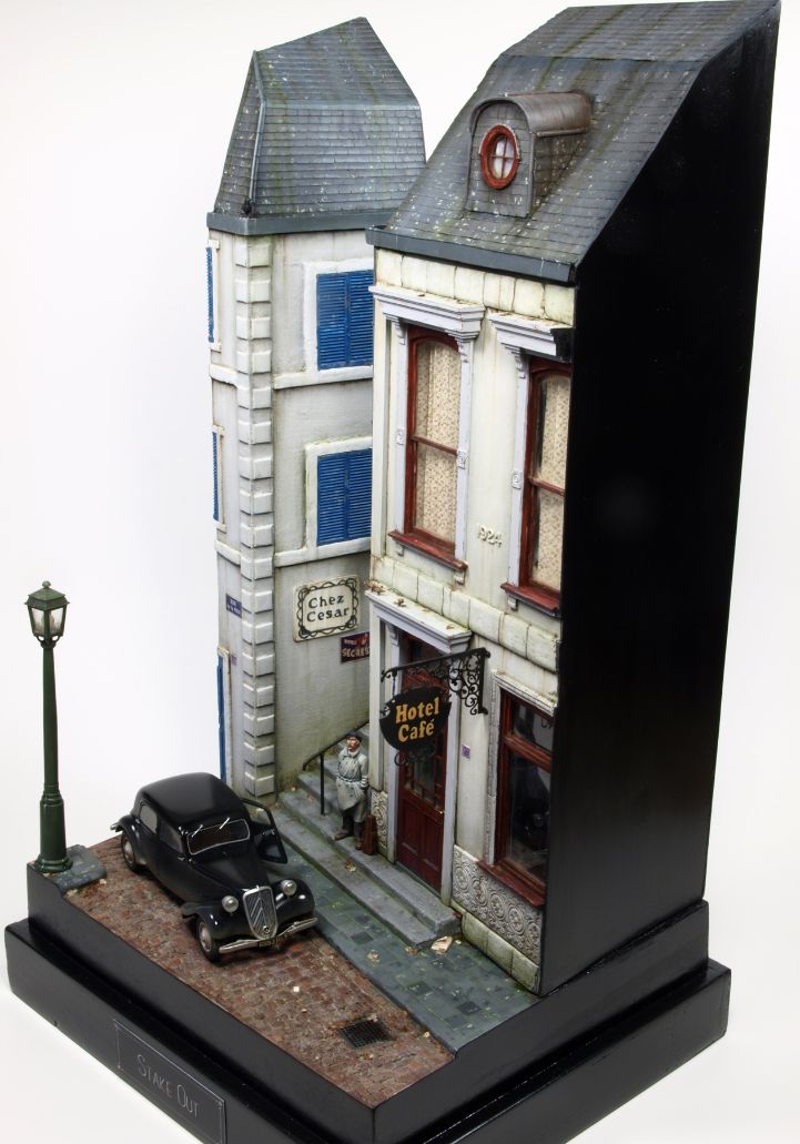
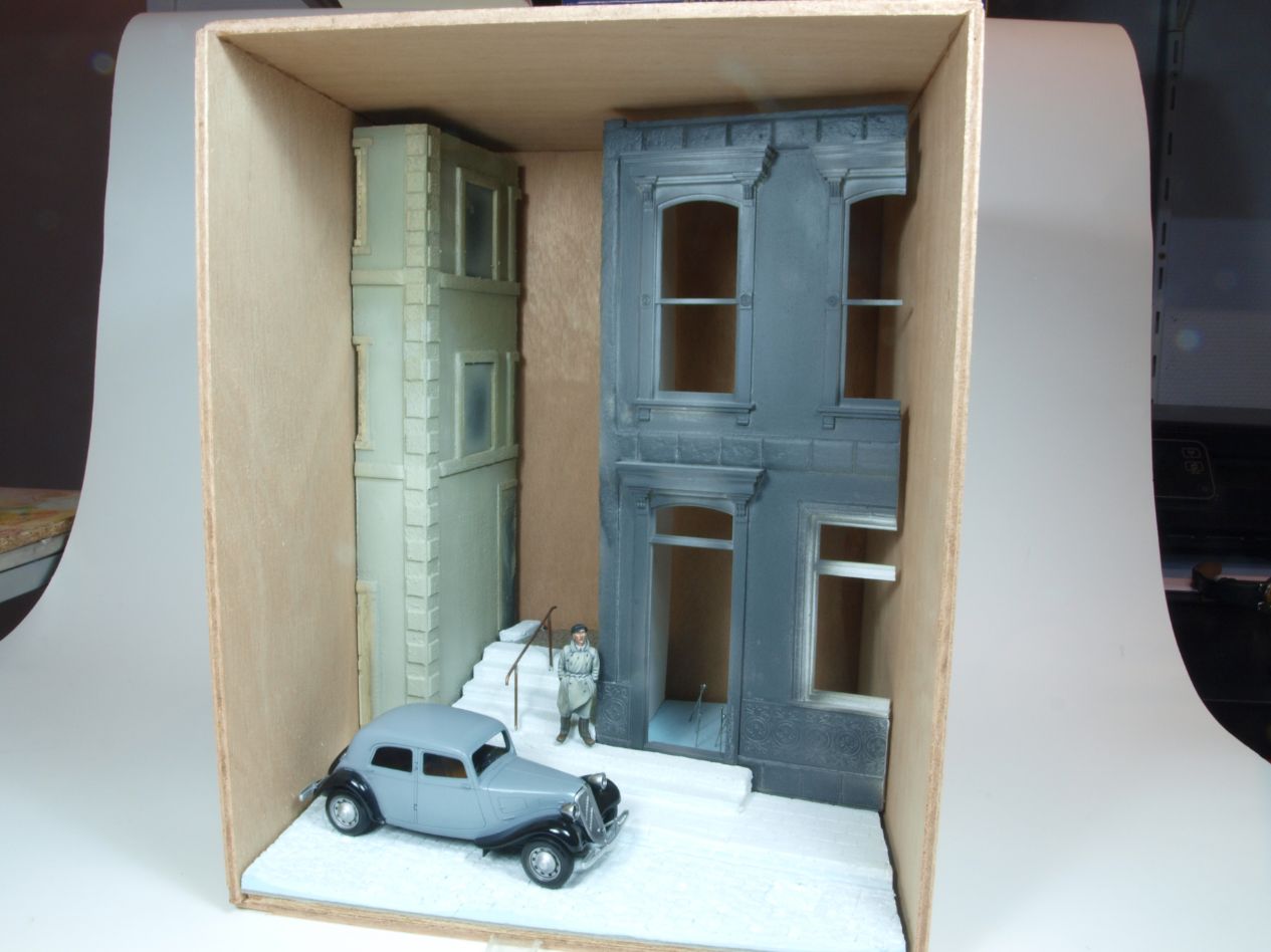
Stake Out – behind the scenes
From concept to finish – the story of Stake Out
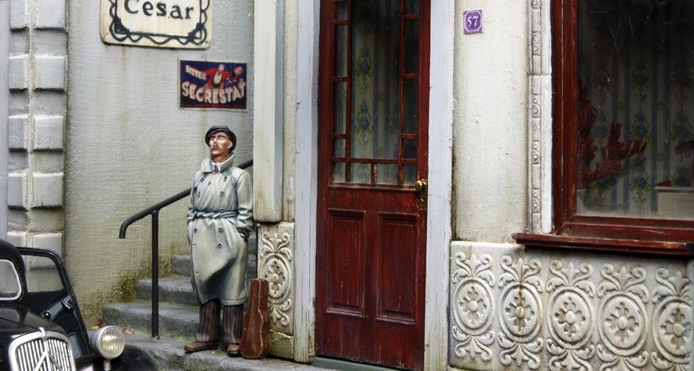
Believe it or not, but although I finished this diorama only recently, it all started as early as 2012 (!). In fact the figure was already painted way back then, and it has been waiting patiently in one of my figure cabinets all these years.
Story and concept
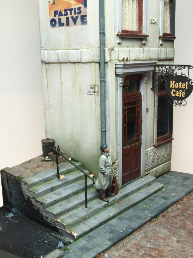
But first things first. The story of the scene was that the viewer is watching a suspicious looking character across the street, that was apparently observing the building the viewer was in. Hence the title Stake Out.
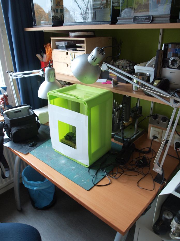
The original idea was that this was to be captured in a shadow box, as it would offer some nice opportunities like targeted lighting and a forced perspective (where the viewer is looking down on the street).
Unfortunately, this was the main reason why the whole idea was put back on the shelf time and time again, because I couldn’t get it to work the way I wanted. I did however, find a way to enable that forced perspective by positioning the inner scene slightly tilted forward and the viewing window should not be traditionally from the front, but placed in an angle towards the top. This would mean that the viewer would more or less look down into the scene.
Well, that sounds pretty good, right? Wrong. And you know why? The scene was set outdoors, obviously, and this resulted in “open” sides that needed to be filled in a logical way. This meant that simply painting the inner side walls black would be totally unrealistic. I had to find a way that the street would continue on either side by painting it or using photographs that happened to match.
Needless to say that the latter option was a dead end street (pun intended) as well, because what are the odds of finding suitable images? The first option was also not viable, as I have no artistic talent for painting or drawing something like what was needed. One needs to be aware of his limitations.
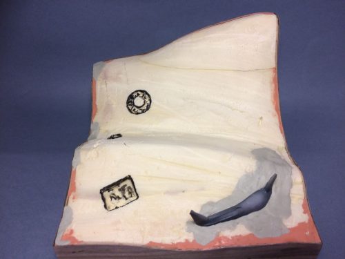
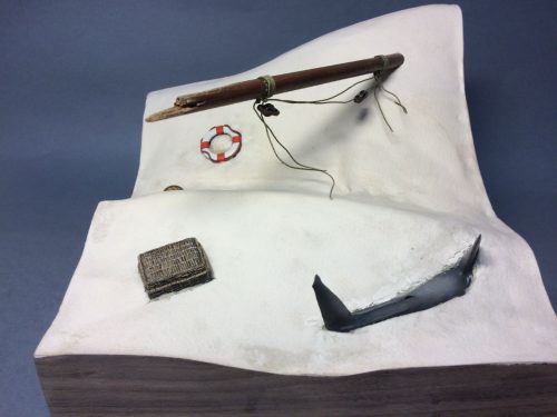
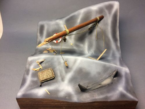
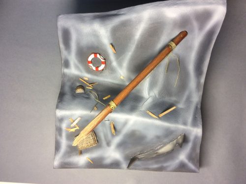
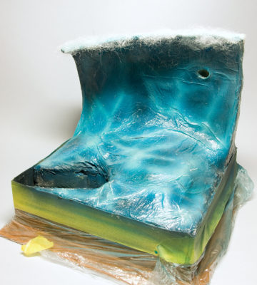
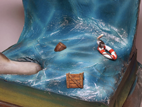
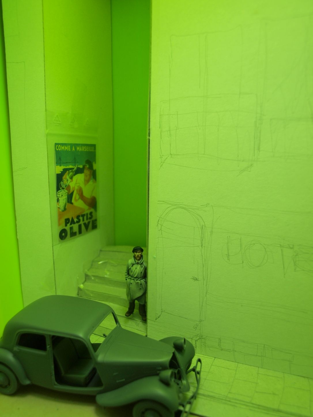
The next four images perhaps give you a better idea of what I described before. The first image is actually more of an explanation why the second is very green 🙂
Change of plans
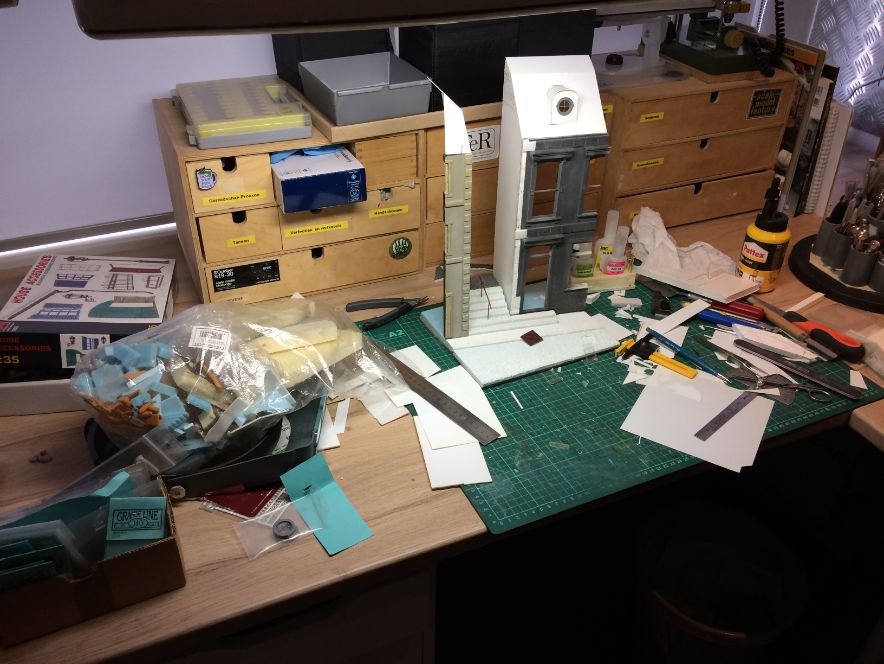
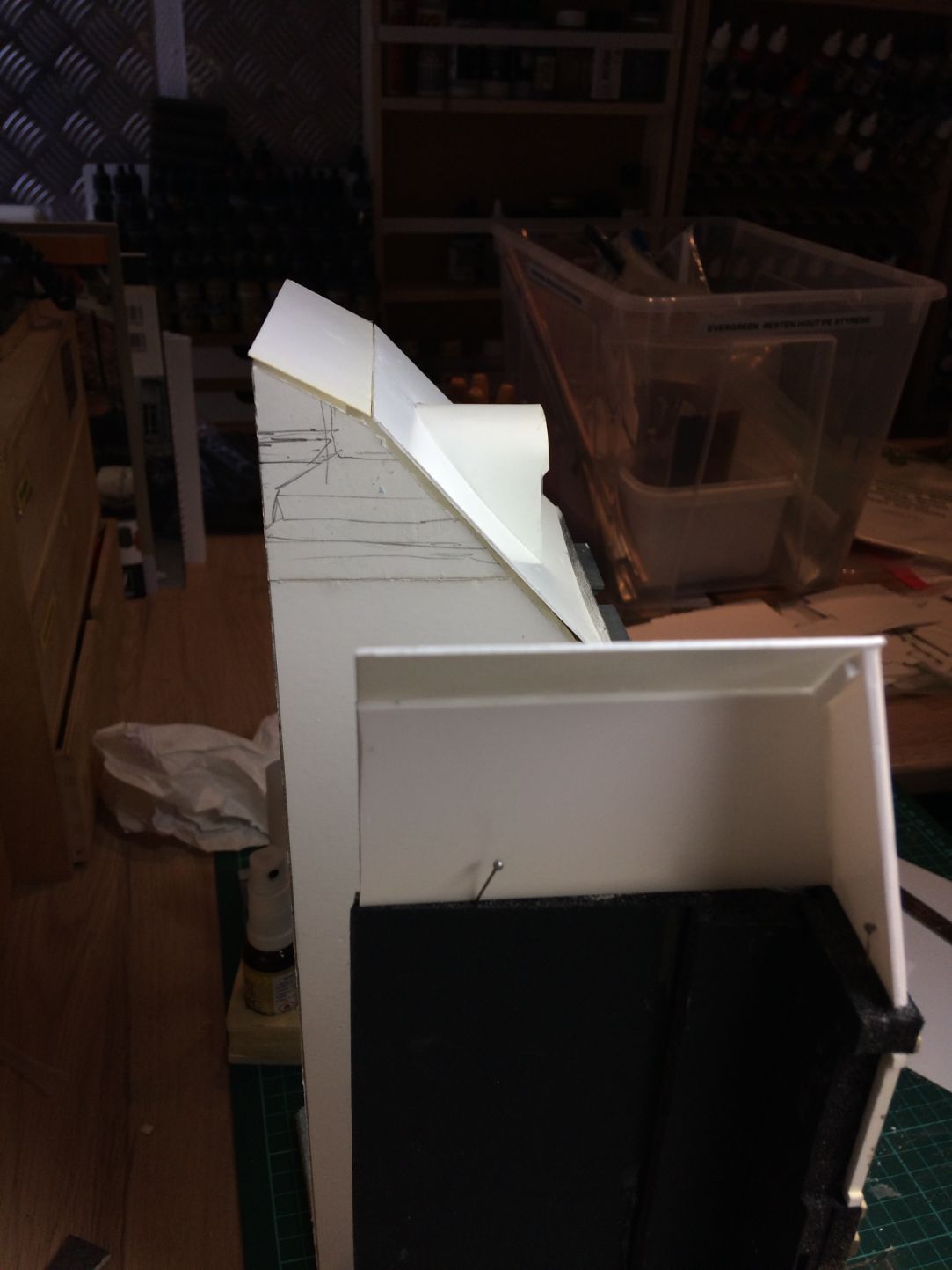
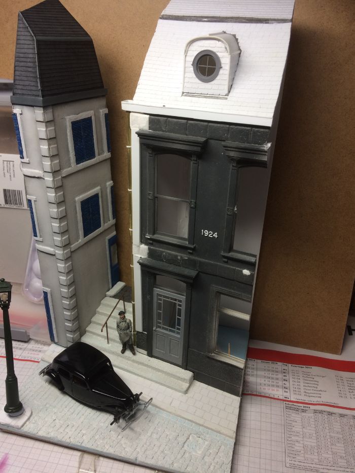
Fast forward to 2020….in a flash of sanity I decided to disband the shadow box idea. This meant that I needed to alter some elements of the scene. The buildings, for example, would be needing roofs. I created the shingles by carving Evergreen strips in what seemed to be and endless job, but I think the result is well worth the effort.
These images show the buildings without and with the roof, after changing the idea from shadow box to a more traditional style diorama.
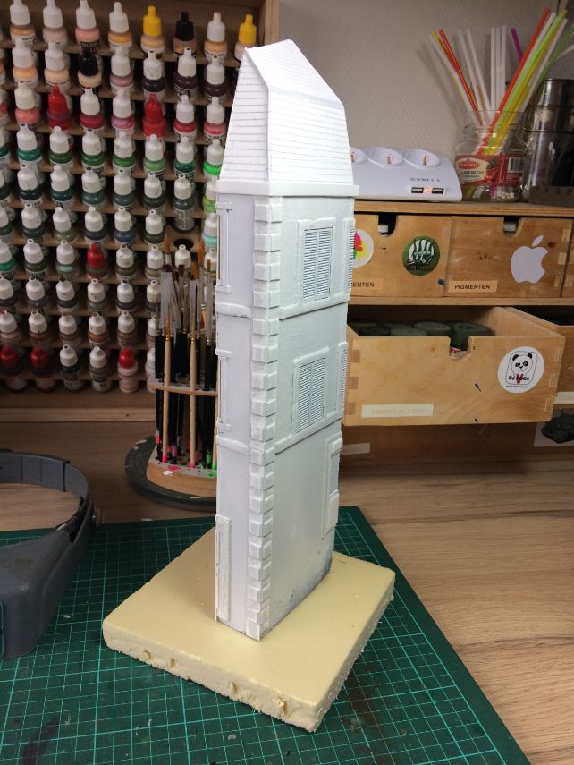
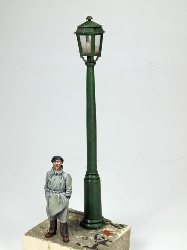
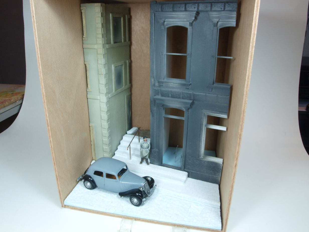
I decided not to change the dimensions of the base as it seemed fine the way it was from the beginning. The only two significant changes I made in the new set up, was to make the base higher using HD foam, and as for the visual part, I added a small section of a side walk opposite of the buildings which provided a better spot to place the already planned street light as well. This gave the scene more visual depth. Well…at least in my universe it does. But more about the base later.
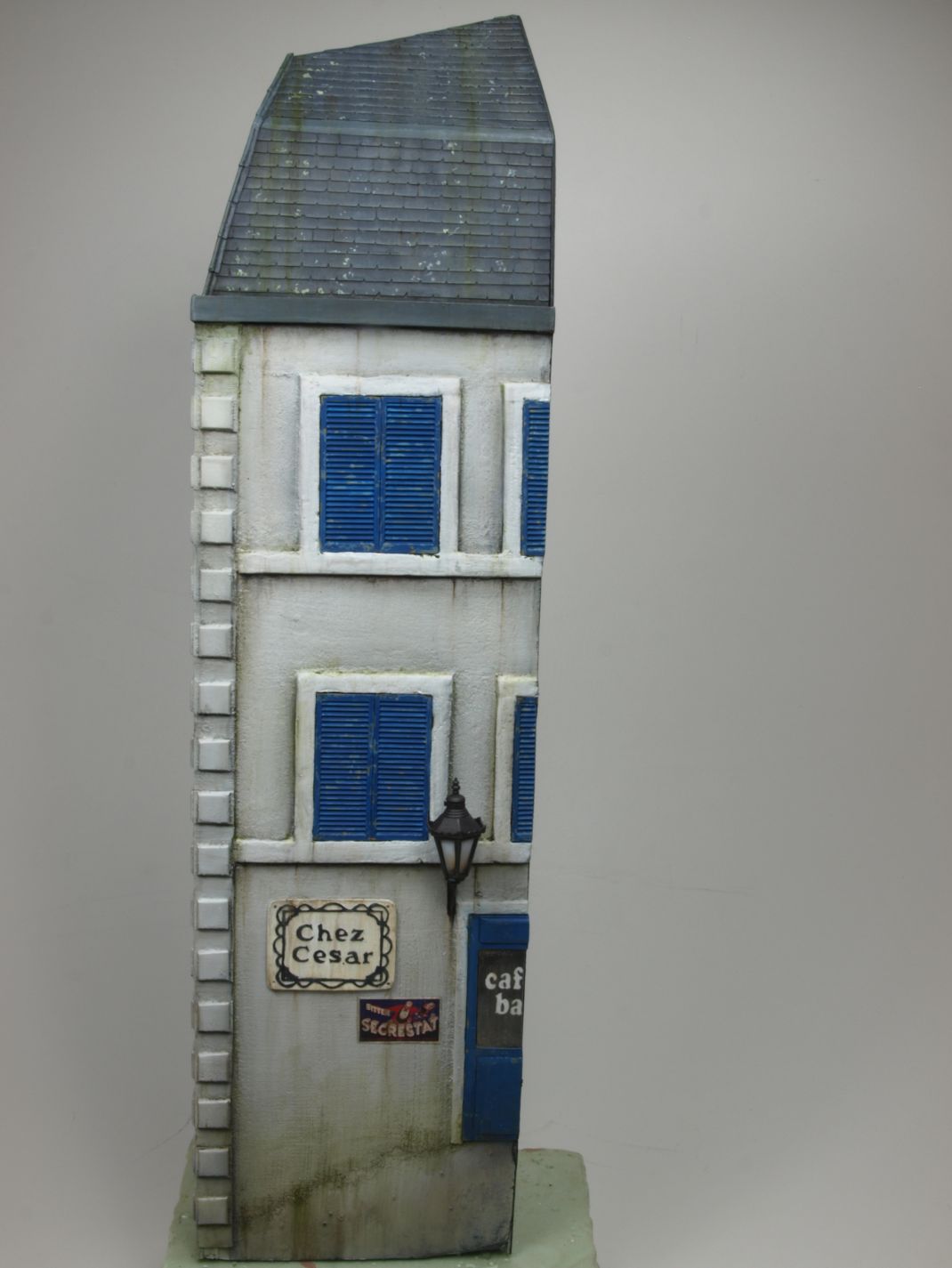
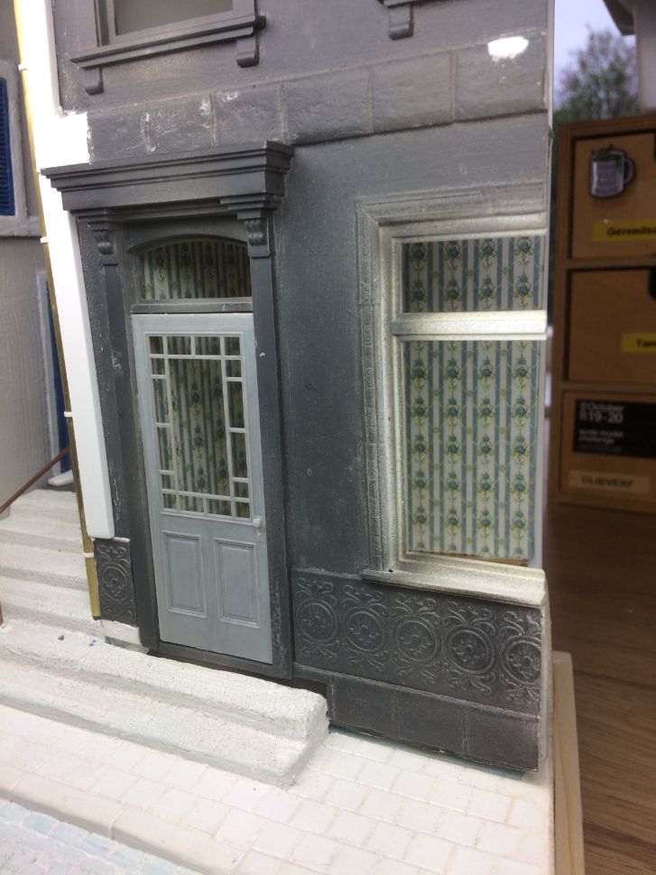
The buildings were constructed of foamboard (foam sandwiched between layers of carton) and I used some architectural elements by Grandt Line, shutters from MiniArt and also scratch build some. I used different types of foam to add more details to the outside walls as well. The side wall of the building on the right, after being replaced because of the roof that was now added, was covered with fast drying wall filler and all buildings were “primed” first with Gesso (a primer for canvas painters). Next I primed them with GWS Chaos Black. Base colours were sprayed on with my airbrush using acrylics.
The images below show some of the described details of the buidlings
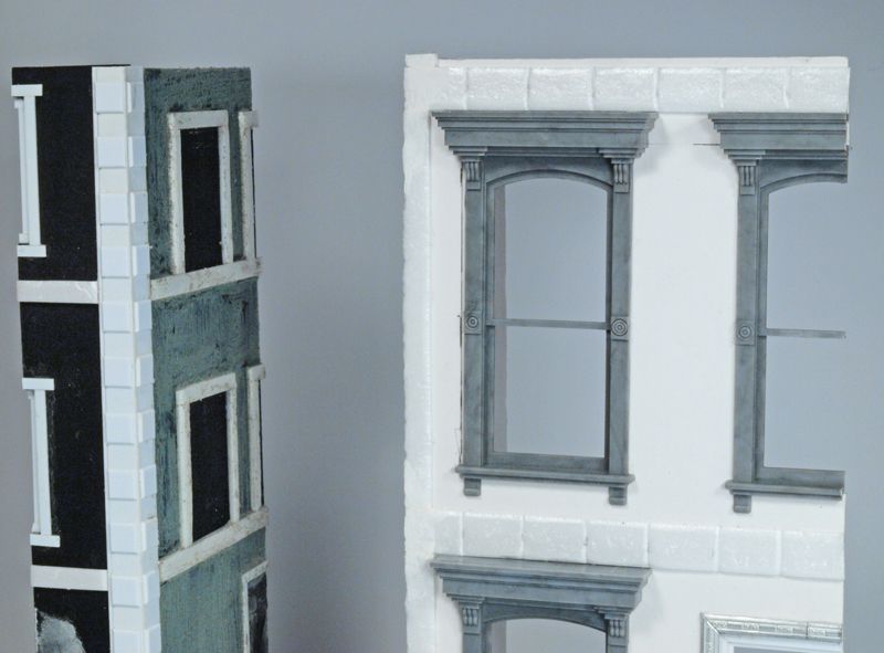
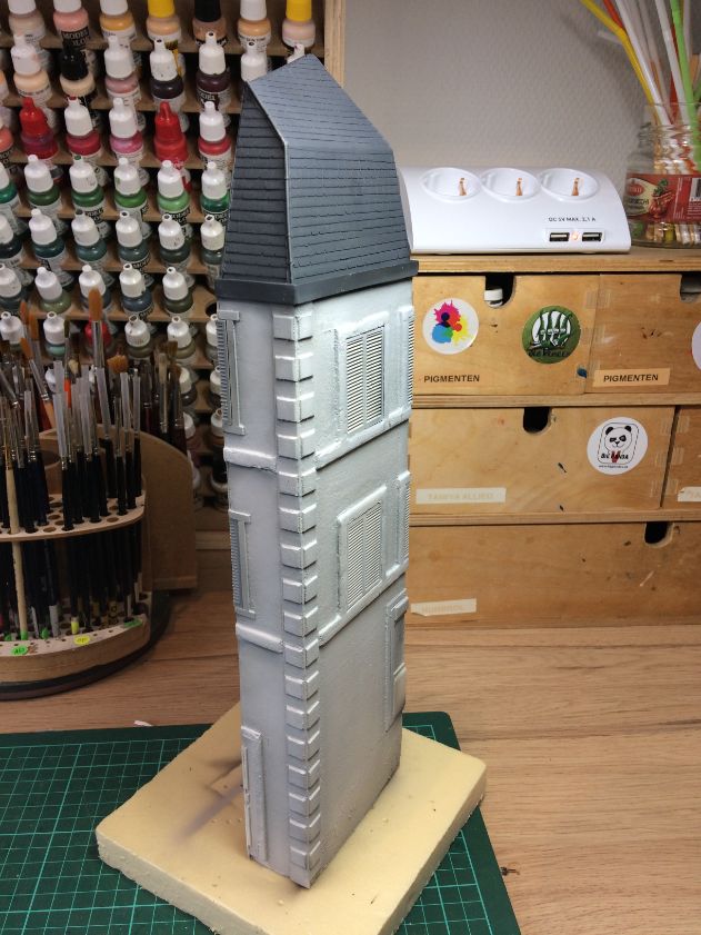
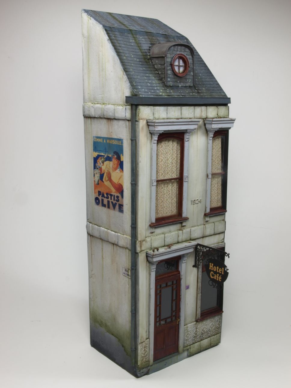
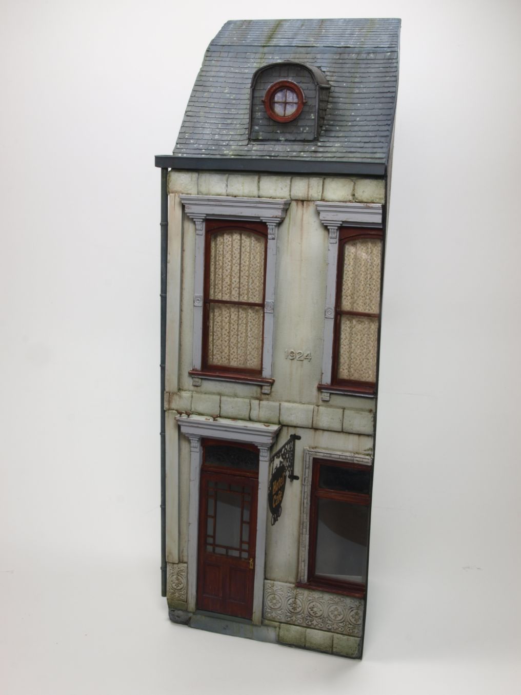
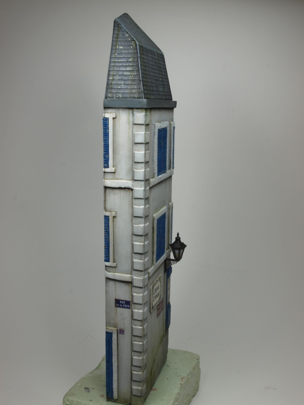
In order to add a bit more visual interest, both houses received different colour tones. In a shadow box, this would have made less of a difference, but since the project turned into a traditional style diorama it became important. At least, in my opinion details like that make the difference between something good and something better.
Subsequent weathering was done with oils, enamels and acrylics. Each of them have their specific advantage and features, which can be used to obtain the desired effects.
The large commercial sign on one of the walls is a decal by Reality In Scale. A solid local gloss layer was applied first, and next I used good amounts of the good old Set & Sol. Call me old school, but I still believe in adding gloss first before adding decals in order to avoid silvering. Prove me wrong!
And this is what the buildings looked like after the weathering stage.
Home improvement excercises
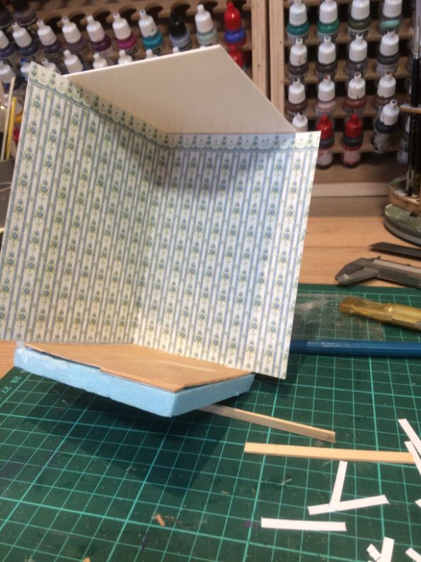
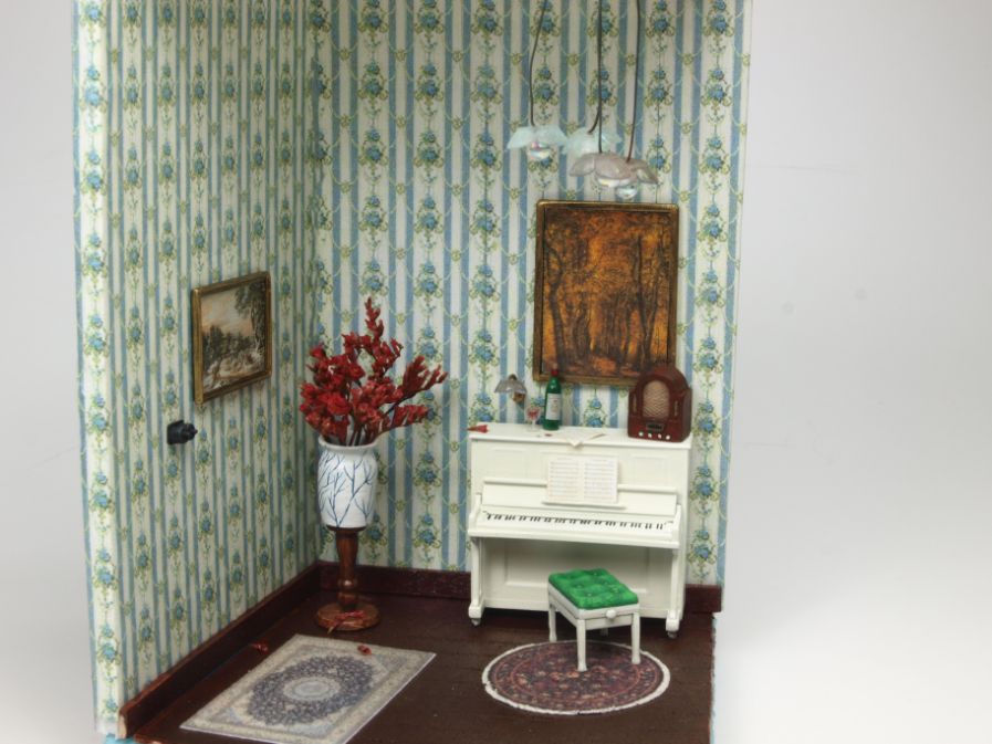
I also decided to add interior to one room of one of the buildings, rather than taking the easy way out and only showing windows with curtains.
I’m not a great fan of interiors when all you need is a building façade to get your message across. After all, I build models and dioramas, not doll houses.
Although I appreciate the extra efforts, not to mention time and expenses that modellers put into showing extra details when dioramas are viewed from the back, those endeavours usually end up with lots of sub stories that add little or nothing at all to the main story. But that’s just my opinion, of course.
Point in case: Did my “piano room” add anything to the story? Not as such, but like I said, only showing windows with closed shuttters or windows is a bit lame too. So there’s my excuse for doing the doll house routine 🙂
Anyway, my spares box as well as MiniArt came to the rescue to make that interior section. And I should mention Margot’s beads collection that I raided to make the wall light and the lamp on the ceiling. I constructed the whole room as a separate section that I could simply slide inside the building at D-Day. D-Day being the day everything would be glued in place on the base.
Here are some in progress shots of my “home improvement” efforts.
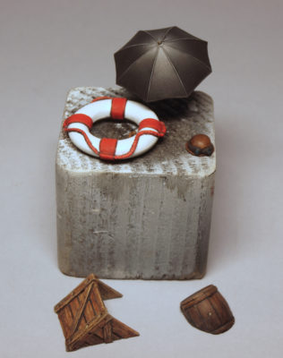
Paraphernalia
On a side note; even after having made quite a few dioramas, I’m still surprised by the number of elements, details if you will, that need to be painted.
In my mind I’m making things simpler every project, but somehow I always get the feeling I’m fooling myself. Adding stuff last minute may contribute to that too, I guess.
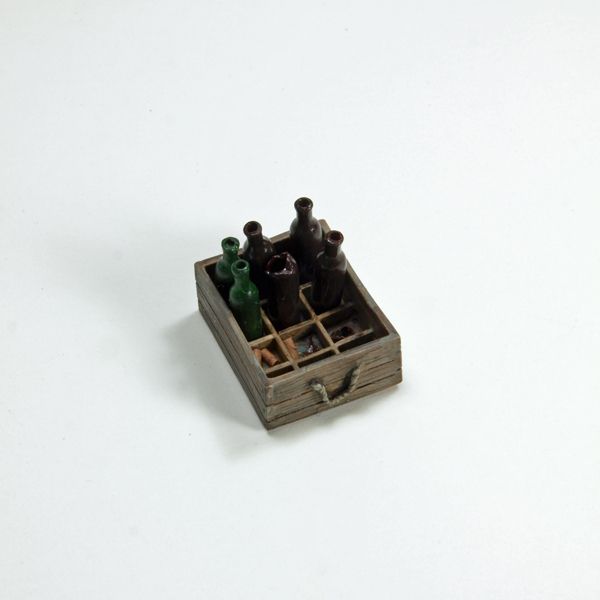
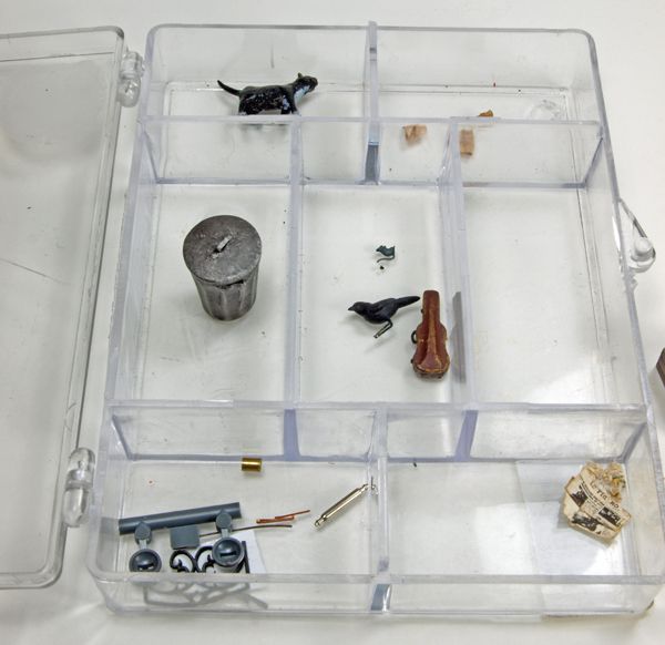
Except for the violin case, these props were added along the way or last minute. Empty and broken bottles, and corks (!), the cat and the mouse and waste paper (coloured in tea). The second pic also shows some left over parts from the kit and other stuff I ended up not using after all.
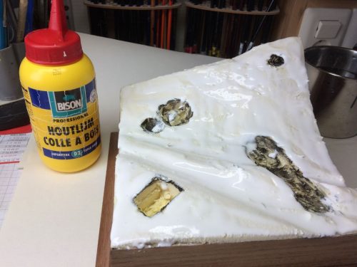
Basic stuff
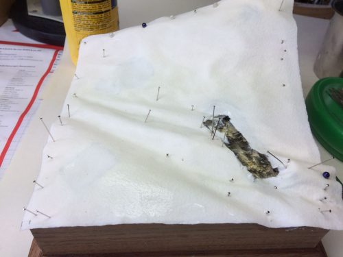
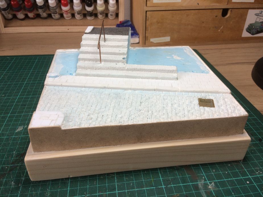
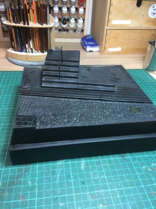
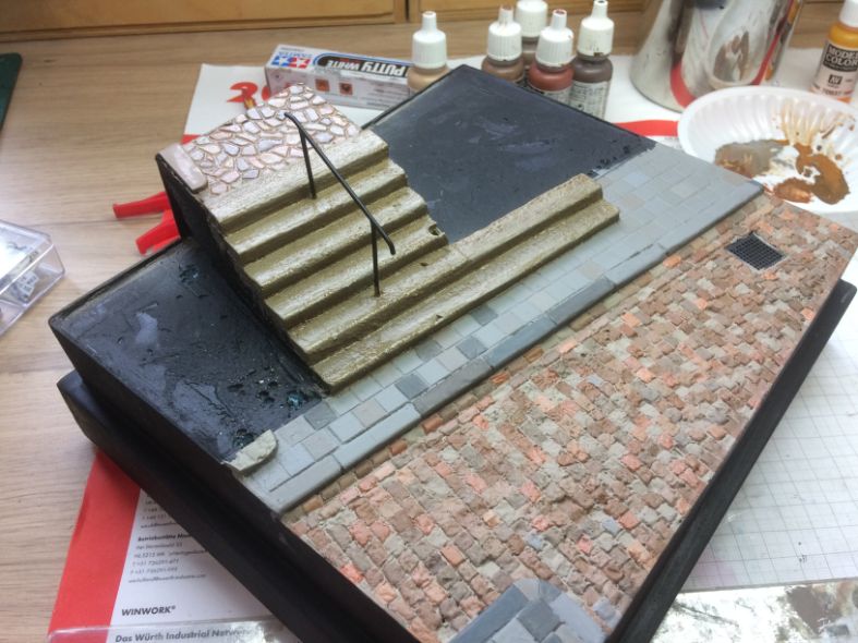
As mentioned before, the base was constructed of HD insulation foam and a top layer of blue HD foam that was scribed to simulate the cobble stone road. Again, Gesso was used as a protective layer before priming with acrylics. I was going to weather the street with oils and white spirit. Most chemical solutions will melt the foam, so a good protective layer is essential.
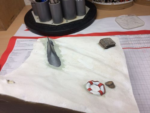
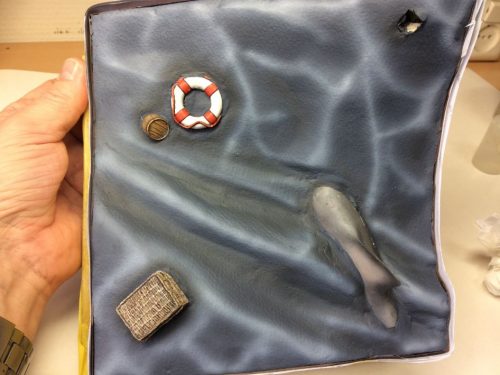
The side walk were completely made of Evergreen sheets and for the curbs I used Evergreen beams. It took me a while to get the right colour and tone for the side walk tiles, but they ended up nicely in the end. I approached painting the cobble stones as well as the side walk in a similar way. I sprayed them in one colour and then painted individual tiles and stones in different tones to create a better visual effect. It really adds to boost the overall impression, and it brings even dead stuff like stones to life.
I assumed that adding some waste and rubbish would also bring the street to life, so I added leaves, waste paper, small printed newspaper pages and empty cigarette packs, and more unidentifiable stuff in random places. Well, actually not entirely random. I also took into account that the wind usually comes from one side, so lots of rubbish ends up in the same corners. Also, where our main character is doing his thing, I dropped cigarette butts.
I used very thin MDF strips to cover the sides of the base. I previously used Evergreen sheets for this job, but working with MDF has some advantages over polystyrene.
From left to right, the base in chronological order of construction and painting.
Baby, you can drive my car
The Citroen is a Tamiya kit that received several colour schemes before I decided that every colour was fine, as long as it was black. A pretty simple build, 98% out of the box. I only added stretched sprue windshield wipers and a new windshield as well as all other windows were cut from thin transparent film, because the kit versions were pretty thick or I managed to screw them up over time for various reasons.
The black paint is actually Alclad Gloss Black Base covered with Alclad Aqua Gloss. Some buffing finished it off. The Chrome parts were “painted” with a Molotow silver marker after all other attempts to achieve a nice chrome finish with other paints failed miserably.
The car was completed by putting a photograph of a lady on the front seat. A detail that hardly anyone will notice in real life when watching the dio, but you know what it’s like: “I know it’s there”.
The picture is obviously of the “subject” that is under observation.
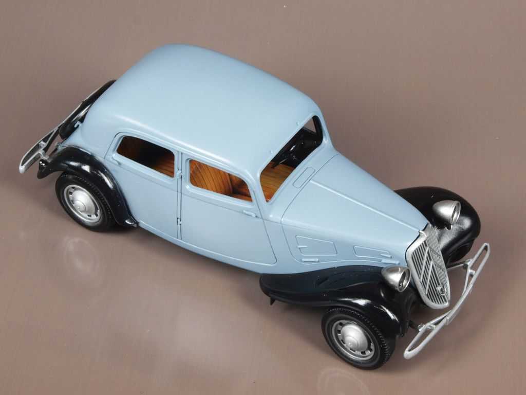
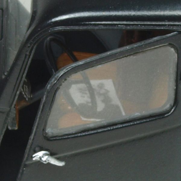
Figure that
As mentioned in the beginning, I finished this figure already in 2012, so besides dusting it off a bit, no additional work was required as I was pretty happy with how it turned out. For the stats: it’s an ancient Verlinden figure that received an MK35 head, and it was painted in acrylics.
Assembly and wrapping up
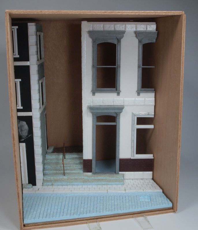
One of the weirdest, or perhaps most exciting moments of building dioramas, at least to me, is when the time comes to fix all elements in their final position, D-Day! You know that “once it’s glued it stays there” moment?
Following a logical sequence when fixing stuff into place sounds pretty obvious, but if you don’t take care and plan it properly you might find yourself twisting your hands and arms, if not your whole body, in order not to break off something in the process because it happens to be very much in the way of things.
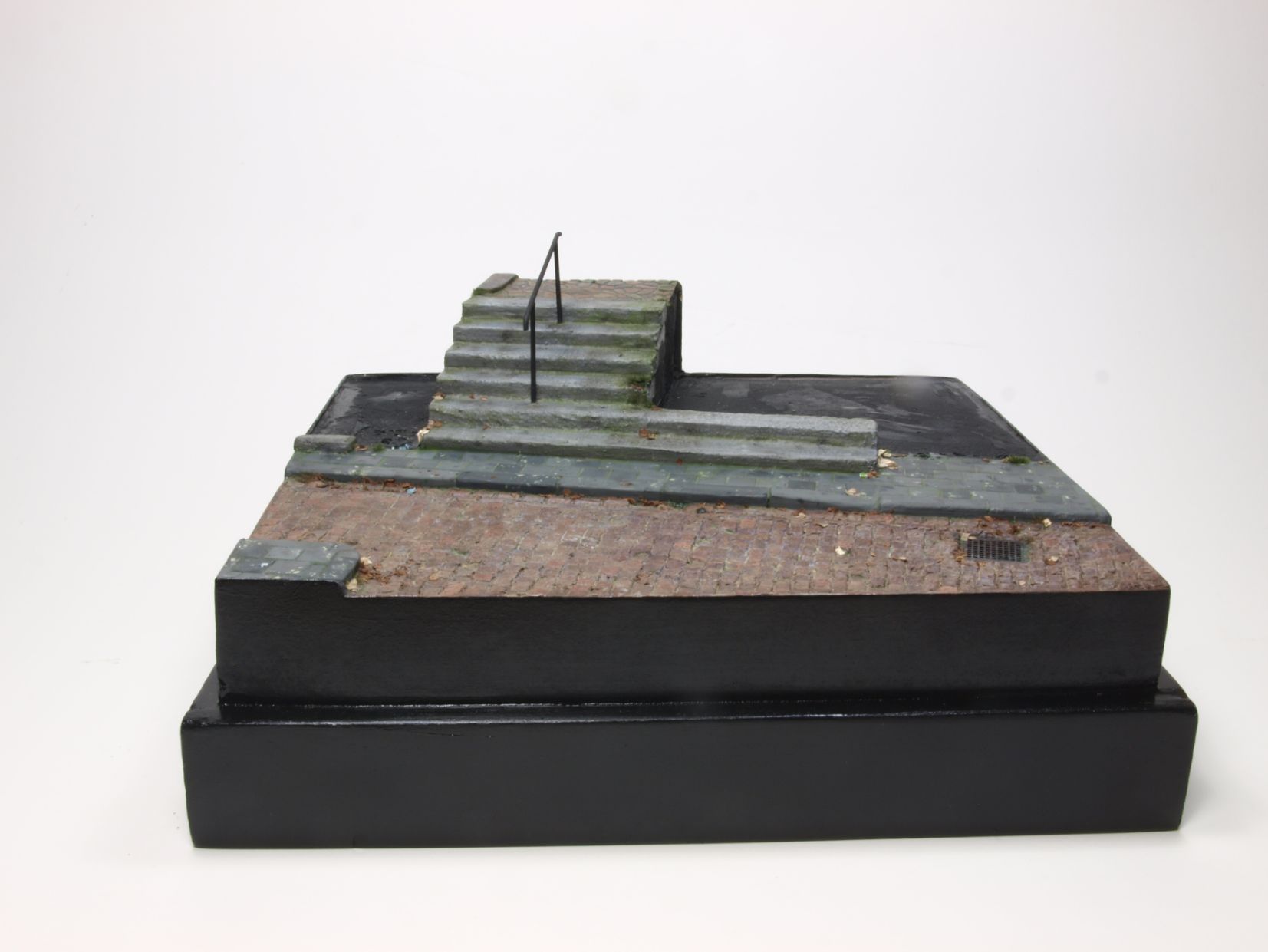
However, in this case it all seemed to work pretty easy indeed. After all, I had many years to think it over, right ? Working from right to left everything was put into place. And there you go…..finally after such a long time I completed this project.
All that was left was to make some pretty pictures of the whole thing and the result of that endeavour can be viewed in my gallery.
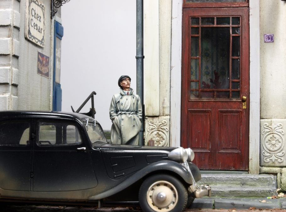
Someone commented on Facebook that it had a good “film noir” feeling. I admit, ladies and gentlemen, that this put a big smile on my face.
Thanks for reading the lengthiest blogpost on this website so far. Hope you enjoyed it and please come back every now and then.